Insights from Genomic Variation
Introduction
Your DNA is your blueprint— or so you’ve been told. While certainly not everything is set in stone from DNA, our genetic makeup can reveal some interesting information about our biology, such as pre-dispositions we may have for developing certain diseases. How can we read the codes of our genetic composition, and what signals should we look for?
The total sum of all gene sequences, including regions that encode proteins along with those that don’t appear to have any function, is known as the genome. The human genome has been compiled from multiple individuals— not one single person— which provides enough evidence to determine the gene sequences that are most likely to be preserved without changes across multiple samples or populations. This assembly is known as a reference genome, a standard genomic scaffolding that is not “normal” or “better”, but one that attempts to represent minimal variation. Therefore, in a given sample, a sequence variation from the reference genome that is observed in >1% of an examined population is called a single nucleotide polymorphism (SNP).
With over 3 billion base pairs in the human genome, there’s a lot of potential SNPs, and since SNPs can exist anywhere within the genome— including in both protein-coding and non-protein coding regions— there’s a lot of variation in the clinical implications of SNPs. Some appear to be significant drivers of disease, while others play much more minor roles or have unknown effects. The Single Nucleotide Polymorphism Database (dbSNP) and ClinVar are two publicly-available curated databases containing clinically-relevant SNP details from published studies and clinical trials, making them invaluable resources for understanding SNPs in sample data.
We’re going to walk through a pipeline that starts with sequencing data from a single individual, annotates key genetic information, and provides clinically-relevant insights. We’ll use the data output that was covered in our previous article, B-lymphocyte cells from a British female as part of The 1000 Genomes Project.
A Note on R
The tidyverse provides an excellent set of tools for data manipulation in R. This tutorial uses tidyverse commands and syntax. It will also use the package cowplot for the plot themes.
Initial sequencing data
Variant call format (VCF) is a standardized format in bioinformatics for reporting SNPs. It looks like this:
#CHROM  POS ID  REF ALT QUAL    FILTER  INFO    FORMAT  SRR038564.bwa-mem.sorted.marked.bam
chr1    49272   .   G   A   5.04598 .   DP=1;SGB=-0.379885;FS=0;MQ0F=0;AC=2;AN=2;DP4=0,0,0,1;MQ=40  GT:PL   1/1:33,3,0
chr1    49291   .   C   T   5.75677 .   DP=1;SGB=-0.379885;FS=0;MQ0F=0;AC=2;AN=2;DP4=0,0,0,1;MQ=40  GT:PL   1/1:34,3,0
chr1    52238   .   T   G   5.04598 .   DP=1;SGB=-0.379885;FS=0;MQ0F=0;AC=2;AN=2;DP4=0,0,0,1;MQ=33  GT:PL   1/1:33,3,0
chr1    54579   .   G   A   3.7766  .   DP=1;SGB=-0.379885;FS=0;MQ0F=0;AC=2;AN=2;DP4=0,0,1,0;MQ=31  GT:PL   1/1:31,3,0
We can see the gene sequences that differ from the reference genome by comparing the REF and ALT columns. In the first row, the REF column (reference genome) contains a G, but the ALT column (our sample data) contains an A. This means that the individual in this dataset has an A at position 49,272 on Chromosome 1, but the reference genome has a G at this location. That’s all we can take from this, though— only this low-level detail about the exact sequence change. The VCF file doesn’t provide any direct insight into genes that may be affected, or phenotypes that may result.
Annotating the sequencing data
To get further information on the gene sequence variants, we have to annotate our dataset. This means that we take our VCF file and match the SNP locations to the annotated human genome assembly, which will tell us the functional regions of the genome (such as specific genes) in which our variants reside. It’s sort of like having a list of locations around the world, and now we need to get the names of the countries for those locations.
To do this, we’ll use the Variant Effect Predictor (VEP) from Ensembl. This is a tool that takes a VCF file as input and produces an annotated output file with specific gene assignments, as well as much more. It can be run from the command-line within a cloud computing environment. Fortunately, eCellula has built an Amazon Machine Image (AMI), a ready-to-use template for an AWS EC2 instance, with the VEP tool pre-installed. This means that you don’t need to sift through documentation manuals or configure any files to get started — we have already prepared the right setting!
To run, use the following code below. The .vcf file location on the server is given in the first line, and the following flags specify some output format details. For more information, check the documentation.
nohup vep -i ../data/SRR038564.called.vcf \
--cache \
--tab \
--compress_output gzip \
--output_file variant_effect_output.txt.gz \
--check_existing \
--symbol \
--clin_sig_allele 1 \
--af \
--regulatory \
--biotype \
--show_ref_allele \
--uploaded_allele \
--pubmed &
Re-formatting the raw annotated output
Now, we have the raw output file from the VEP tool with the following format (only showing the first 6 columnns):
# A tibble: 6,522,352 × 30
   `#Uploaded_variation` Location   Allele Gene            Feature   Feature_type
   <chr>                 <chr>      <chr>  <chr>           <chr>     <chr>
 1 chr1_49272_G/A        chr1:49272 A      ENSG00000268020 ENST0000… Transcript
 2 chr1_49291_C/T        chr1:49291 T      ENSG00000268020 ENST0000… Transcript
 3 chr1_52238_T/G        chr1:52238 G      ENSG00000268020 ENST0000… Transcript
 4 chr1_54579_G/A        chr1:54579 A      ENSG00000268020 ENST0000… Transcript
 5 chr1_54579_G/A        chr1:54579 A      ENSG00000290826 ENST0000… Transcript
 6 chr1_56573_T/C        chr1:56573 C      ENSG00000268020 ENST0000… Transcript
 7 chr1_56573_T/C        chr1:56573 C      ENSG00000290826 ENST0000… Transcript
 8 chr1_61987_A/G        chr1:61987 G      ENSG00000240361 ENST0000… Transcript
 9 chr1_61987_A/G        chr1:61987 G      ENSG00000186092 ENST0000… Transcript
10 chr1_61987_A/G        chr1:61987 G      ENSG00000290826 ENST0000… Transcript
# ℹ 6,522,342 more rows
We’ll re-format this data to improve its readability. It may be helpful later on to have the information in the Location column split separately to show the chromosome, start position, and end position. But we’ll also want to retain the original Location information in a different format.
vep_output_processed <-
  vep_output %>%
  rename(Uploaded_variation = `#Uploaded_variation`) %>%
  separate_wider_delim(
    Location, ":", names = c("chrom", "loc")
  ) %>%
  separate_wider_delim(
    loc, "-", names = c("start", "end"), too_few = "align_start"
  ) %>%
  mutate(
    start = as.numeric(.$start),
    end = as.numeric(.$end),
    end = case_when(is.na(end) ~ start),
    Location = paste0(chrom, ":", start, "-", end)
  )
Filtering and summarizing data
Now, our data look like:
# A tibble: 6,522,352 × 36
   Uploaded_variation chrom start   end Allele Gene            Feature    Feature_type
   <chr>              <chr> <dbl> <dbl> <chr>  <chr>           <chr>      <chr>
 1 chr1_49272_G/A     chr1  49272 49272 A      ENSG00000268020 ENST00000… Transcript
 2 chr1_49291_C/T     chr1  49291 49291 T      ENSG00000268020 ENST00000… Transcript
 3 chr1_52238_T/G     chr1  52238 52238 G      ENSG00000268020 ENST00000… Transcript
 4 chr1_54579_G/A     chr1  54579 54579 A      ENSG00000268020 ENST00000… Transcript
 5 chr1_54579_G/A     chr1  54579 54579 A      ENSG00000290826 ENST00000… Transcript
 6 chr1_56573_T/C     chr1  56573 56573 C      ENSG00000268020 ENST00000… Transcript
 7 chr1_56573_T/C     chr1  56573 56573 C      ENSG00000290826 ENST00000… Transcript
 8 chr1_61987_A/G     chr1  61987 61987 G      ENSG00000240361 ENST00000… Transcript
 9 chr1_61987_A/G     chr1  61987 61987 G      ENSG00000186092 ENST00000… Transcript
10 chr1_61987_A/G     chr1  61987 61987 G      ENSG00000290826 ENST00000… Transcript
# ℹ 6,522,342 more rows
This re-formatted file can still be processed further. Since the data includes some non-standard chromosome technical artifacts (like 11_KI270721v1_random), we want to filter for the variants on only the standard chromosomes 1-23 (where here the 23rd chromosome is X) plus the mitochondrial chromosome. Also, we want to only examine the protein-coding variants; and more specifically, only the unique variants at each location for each gene. Then, we’ll get a count of all these variants on each chromosome using the group_by and summarize commands.
vep_output_processed_count <-
  vep_output_processed %>%
  filter(
    chrom %in% c(
      "chr1", "chr2", "chr3", "chr4", "chr5", "chr6", "chr7",
      "chr8", "chr9", "chr10", "chr11", "chr12", "chr13", "chr14",
      "chr15", "chr16", "chr17", "chr18", "chr19", "chr20", "chr21",
      "chr22", "chrX", "chrM"
    ),
    BIOTYPE == "protein_coding"
  ) %>%
  distinct(Location, Gene, .keep_all = TRUE) %>%
  group_by(chrom) %>%
  summarize(count = n())
Joining data
Now, we want to combine these summarized variant counts by chromosome with actual chromosomal base pair summary data, to get an idea of the percentage of entire chromosomes that our data represent. We’ll do this by loading the most recent assembly of the human genome (GRCh38, build 38) from Ensembl and processing the file a little:
# https://www.ncbi.nlm.nih.gov/datasets/genome/GCF_000001405.26/
grch38 <-
  read_tsv("~/ecellula/pipeline/grch38.tsv")

grch38_bp <-
  grch38 %>%
  select(`UCSC style name`, `Seq length`) %>%
  rename(
    chrom = `UCSC style name`,
    bp = `Seq length`
  ) %>%
  filter(chrom %in% c(
    "chr1", "chr2", "chr3", "chr4", "chr5", "chr6", "chr7",
    "chr8", "chr9", "chr10", "chr11", "chr12", "chr13", "chr14",
    "chr15", "chr16", "chr17", "chr18", "chr19", "chr20", "chr21",
    "chr22", "chrX", "chrM"
  ))
Then, we’ll join the summarized variant counts to the processed chromosomal summary data, and calculate two percentages: the number of variants on a chromosome as a percentage of the total variants in our dataset (i.e., 15% of the variants in our dataset are on Chromosome 1), and the number of variants in our dataset on a chromosome as a percentage of the total base pairs on that chromosome (i.e., the variants in our dataset on Chromosome 1 represent 25% of the size of Chromosome 1). These percentages will be helpful to see if any chromosome are over- or under-represented in our datasets, and if any chromosomes seem particularly under- or over-impacted.
vep_output_summarized <-
  left_join(
    vep_output_processed_count, grch38_bp, by = "chrom"
  ) %>%
  mutate(
    variantTotal = (sum(count)),
    pctTotal = (count/variantTotal) * 100,
    pctChrom = (count/bp) * 100,
    chrom = factor(
      chrom,
      levels = c(
        "chr1", "chr2", "chr3", "chr4", "chr5", "chr6", "chr7", "chr8", "chr9",
        "chr10", "chr11", "chr12", "chr13", "chr14", "chr15", "chr16", "chr17",
        "chr18", "chr19", "chr20", "chr21", "chr22", "chrX", "chrM"
      )
    )
  )
Visualizing data: Part 1
Before we start making any summary visualizations, let’s just take a look at the raw locations of the identified protein coding variants:

It’s pretty cool to see our data in this way! It’s a good reminder that each variant we observe is a real base pair on a chromosome. Although a more interaction visualization would be helpful to zoom in on each variant, or filter them in specific ways, we can at least immediately see here there’s a distinct pattern of distribution. Certain spots on chromosomes clearly have more variants than others, with definite gaps apparent. We won’t go into what this means for now, as it could be that those gaps in the genome aren’t functionally significant, but it’s something to keep in mind anytime you are considering the impact of variation.
We can even take this a step further with an interactive visualization:
Hover over a point to see more detail about the SNP. You can filter by chromosome, impact, and gene! Just begin typing some genes to get started.
Visualizing data: Part 2
Now, let’s make a visualization of the number of protein-coding variants per chromosome as a percentage of the total variants in the dataset. We’ll use polar coordinates so the plot is circular, with the largest chromosome (Chromosome 1) positioned at 12 o’clock and the remaining chromosomes following clockwise in descending size order.
plot_pctTotal <-
  vep_output_summarized %>%
  filter(chrom != "chrM") %>%
  ggplot(aes(x = chrom, y = pctTotal, fill = bp)) +
  geom_col() +
  labs(y = "% Variants in Dataset") +
  scale_fill_gradient(
    "Base Pairs",
    low = "gray",
    high = #56B4E9"
  ) +
  coord_polar() +
  theme_cowplot() +
  theme(
    axis.title.x = element_blank()
  )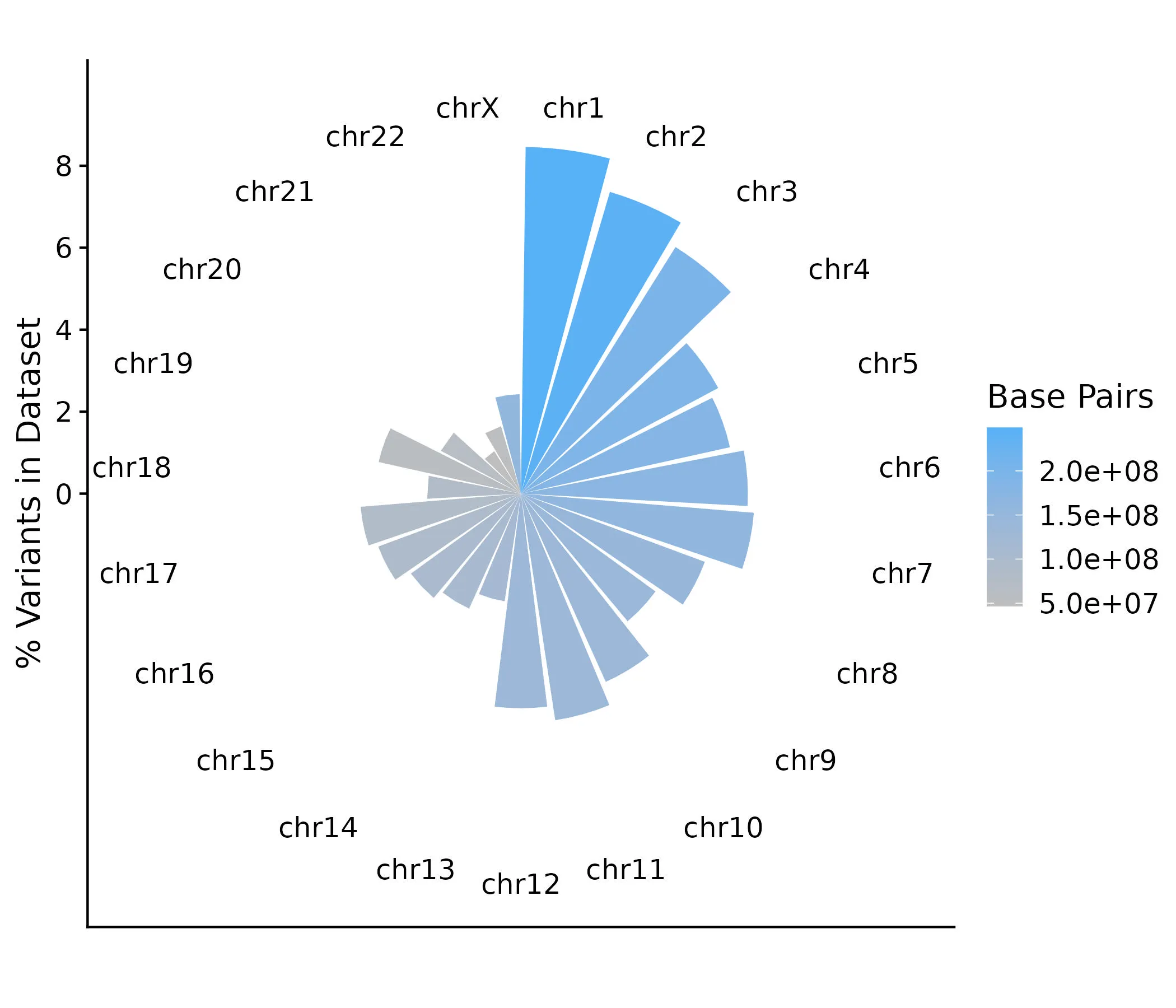
From this, we can see a general trend that most of the variants in our dataset are on the larger chromosomes— which makes sense— but this is not uniform. Surprisingly few variants appear on Chromosome 9 given its size, while more variants may be on Chromosomes 17 and 19 than comparatively expected.
Now, let’s look at the composition of protein-coding variants in our dataset on each chromosome, relative to the size (number of base pairs) of the chromosome.
plot_pctChrom <-
  vep_output_summarized %>%
  filter(chrom != "chrM") %>%
  ggplot(aes(x = chrom, y = pctChrom, fill = bp)) +
  geom_col() +
  labs(y = "% Variants on Total Chromosome") +
  scale_fill_gradient(
    "Base Pairs",
    low = "gray",
    high = "#CC79A7"
  ) +
  coord_polar() +
  theme_cowplot() +
  theme(
    axis.title.x = element_blank()
  )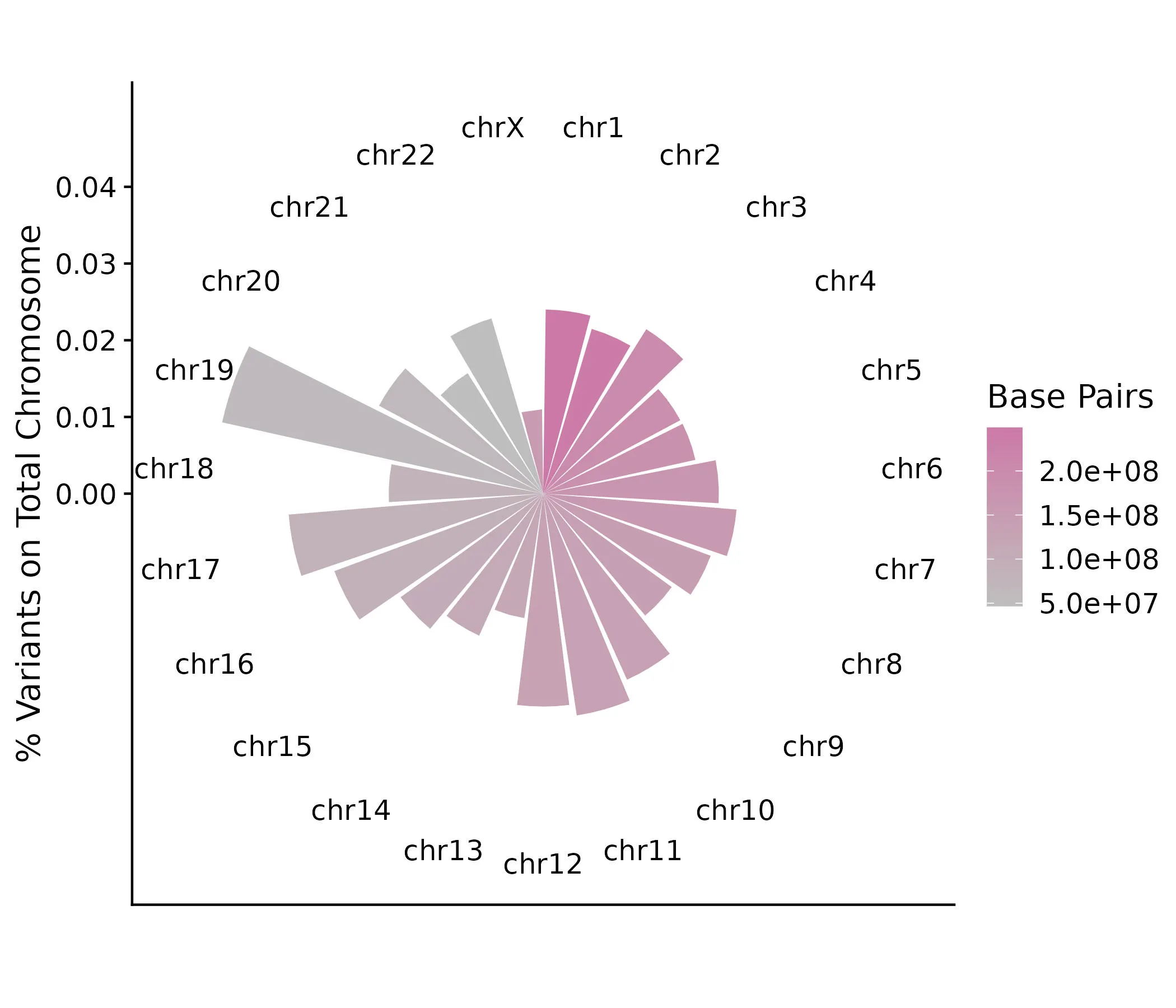
This plot definitely shows some different patterns than the previous one. Although Chromosome 1 is the largest chromosome, it does not contain a particularly large proportion of variants from our dataset, appearing mostly similar to all the chromosomes through Chromosome 12 (excluding 9). What stands out, though, is the proportion of variants on the smaller chromosomes, in particular 19, 17, and 22. Though more work will need to be done to determine what this significance is, this is a good exercise in seeing how certain visualizations and summaries can influence interpretations of the data.
As a last step for now, let’s make a visualization that begins to address the clinical relevance of our variants. Similar to how we grouped and summarized the counts of protein-coding variants by chromosome, we’ll group by gene (coded by gene symbol) and count the number of variants that are associated with each gene. We’ll plot the top 10 genes that are associated with the greatest numbers of variants in our dataset.
plot_countSymbol <-
  vep_output_processed %>%
  filter(
    chrom != "chrM",
    SYMBOL != "-",
    BIOTYPE == "protein_coding"
  ) %>%
  group_by(SYMBOL) %>%
  summarize(countSymbol = n()) %>%
  arrange(-countSymbol) %>%
  slice(1:10) %>%
  ggplot(
    aes(x = reorder(SYMBOL, countSymbol), y = countSymbol)
  ) +
  geom_col(fill = "#D55E00") +
  labs(
    y = "Number of Variants associated with Gene"
  ) +
  coord_flip() +
  theme_minimal_vgrid() +
  theme(
    axis.title.y = element_blank()
  )
A plot like this is a good starting point to explore what clinically-relevant diseases and phenotypes our variants may be associated with. Although gene symbols appear unfamiliar to most people, those with appropriate expertise can easily identify these gene symbols as if they were everyday words. RBFOX1, for example, is known to be associated with autism spectrum disorder, whereas CACNA1C encodes a well-known subunit of a calcium channel.
Further investigating clinical relevance of variants
We’ll go back to the vep_output_processed dataset earlier that we got by processing the raw output from the VEP tool.
ClinVar is a curated variant database that contains a lot of information about individual variants, including clinically-relevant phenotypes and clinical significance scores. We want to match this database to the variants in our dataset. We’ll identify all the entries in the Clinvar database that match the location (chromosome:start-end) of the variants in our dataset.
# wget https://ftp.ncbi.nlm.nih.gov/pub/clinvar/tab_delimited/variant_summary.txt.gz
clinvar <-
  read_tsv("~/Downloads/variant_summary.txt.gz")

clinvar_vep <-
  clinvar %>%
  mutate(Location = paste0("chr", Chromosome, ":", Start, "-", Stop)) %>%
  filter(
    Assembly == "GRCh38",
    Location %in% vep_output_processed$Location
  )
ClinVar includes the clinically-relevant phenotypes in a single column separated by the character |. We want to split this out so that each phenotype has its own row. This means that a single variant entry can be duplicated across mulitple rows, differing only in the phenotype entry.
clinvar_phenotypes_count <-
  clinvar_vep %>%
  separate_longer_delim(PhenotypeList, "|") %>%
  group_by(PhenotypeList) %>%
  summarize(count = n())
Visualizing data: Part 3
This lets us group the variants by phenotype and then summarize the counts of each variant per phenotype, allowing us to see which phenotypes from matched variants in the ClinVar database have the greatest number of counts in our dataset. This analysis and visualization is similiar to the gene count plot done earlier.
clinvar_vep_phenotypes <-
  left_join(clinvar_vep, clinvar_phenotypes_count, by = "PhenotypeList") %>%
  filter(!PhenotypeList %in% c("not provided", "not specified", "Inborn genetic diseases")) %>%
  distinct(PhenotypeList, .keep_all = TRUE) %>%
  arrange(-count)

plot_phenotype <-
  clinvar_vep_phenotypes %>%
  slice(1:10) %>%
  ggplot(
    aes(x = reorder(PhenotypeList, count), y = count)
  ) +
  geom_col(fill = "#009E73") +
  scale_x_discrete(label = function(x) str_trunc(x, 40)) +
  labs(
    y = "Number of Variants in ClinVar"
  ) +
  coord_flip() +
  theme_minimal_vgrid() +
  theme(
    axis.title.y = element_blank()
  )
Conclusion
Lastly, we can put all the plots together! This is a nice summary of everything we’ve learned so far from our starting VCF file, which for our purposes only showed how and where individual variants differed from a reference genome. In annotating the VCF file, we matched the variants to known entries in the dbSNP database, linked the variants to specific genes, and gained insight into potential associated phenotypes. This type of high-throughput, high-performance pipeline can be applied at scale to continually investigate the scope of variation in the human genome.
In our next article, we’ll show how to leverage Nextflow to run these scripts and tools in an integrated workflow within AWS.
plot_all <-
  plot_grid(
    plot_pctTotal, plot_countSymbol,
    plot_pctChrom, plot_phenotype,
    nrow = 2,
    rel_widths = c(1.5, 1.5),
    labels = c("A", "C", "B", "D")
  )
